
01.05.2022 - 23.05.2022 // Week 6 - Week 8
Yong Li Qing Vernice / 0352288Bachelor of Design (Hons) in Creative Media
Advanced Typography
Task 2 (A & B) / Key Artwork & Collateral
LECTURE
Advanced Typography / Week 1- Week 5 Lectures
LECTURE
Advanced Typography / Week 1- Week 5 Lectures
INSTRUCTION
Task 2 (A) - Key Artwork
In Task 2(A) we are told to design a key artwork that represented ourselves by using letters from our names. There are some design directions given by Mr Vinod that we can think of in the process of designing our key artwork. It can be an occupation that we would be if we are not being a designer.
I had once dreamt of being a grand piano maker one day because I believe that making an instrument is like creating a new soul, when a musician plays a piece on an instrument, it gives a brand new life to the music. Therefore, I decided to design a key artwork that related to music and grand piano.
Progression
A. Explore
Before I start designing the key artwork, I explored and studied the structure of a grand piano by searching images (Fig 1.1- Fig 1.5) on Pinterest as well as know more about grand pianos on Wikipedia.


Fig1.1 - Fig1.2 Images from Pinterest


Fig1.3 - Fig1.4 Images from Pinterest

Fig 1.5 Reference from Pinterest
B. Sketch and Digitalize the ideas
After studying the structure of the grand piano, I draw out the elements that are included in the grand piano. Hence, using the letters V and Y from my name Vernice Yong, I try playing out the elements I discover and make multiple different combinations out of them (Fig 1.6), as Mr Vinod said (Fig 1.7) is quite interesting so I decided to move on with it (Fig 1.7).
Fig 1.6 Progression
Fig 1.7 The key artwork was chosen to move on
In the progress of modifying the key artwork, I experimented more other combinations by rearranging the sequence of the key artworks within different spaces and colours. (Fig 1.8) But I can't satisfy any of them so I decided to continue with the first (Fig 1.7)
Fig 1.8 The experiment in rearranging the key artwork
From the chosen key artwork (Fig 1.7) I found that there are parts of the key artwork that needed to improve to create a more comfortable design. (Fig 1.9) Hence, I modified the key artwork little bit by bit to make it look better. (Fig 1.10 - Fig 1.13)
Fig 1.9 Parts of the Key Artwork that needed to improve
Fig 1.10 Round the corners
Fig 1.11 Increase the curves for the inner shape
Fig 1.12 Adding the thickness of the Y
Fig 1.13 increases the tail of Y
The process showcases the key artwork is form. (Fig 1.14 - Fig 1.18)
Fig 1.14 The process of the thickness added
Fig 1.15 The process of round corners
Fig 1.16 The process of the shape modifying
Fig 1.17 the process of the depth of the letter Y's tail
Fig 1.18 The Process of Y
Next, I added a piano keyboard to the key artwork and experimented with different ways to place it because I felt that the key artwork has too much white space. Therefore, I tried to fill up the white spaces. (Fig 1.19) In the process, after adding the keyboard I surprisingly found that (Fig 1.20) look better than (Fig 1.21) as it looks more balance.

Fig 1.19 Adding piano keys into the key artwork
Fig 1.20 - Fig 1.21 The experimental outcome of the Key Artwork
Besides that, I also experiment with using different background colours for the key artwork. (Fig 1. 22 - Fig 1.23) But they didn't match my theme for my design. The theme for my key artwork is a magical, mysterious place where music flew everywhere. Thus, I found a colour palette from Pinterest (Fig 1.24) that match the colours that I thought.


Fig 1.22 - Fig 1.23 Key artwork with colour background

Fig 1.24 Colour palette form Pinterest
I downloaded fonts named Magic Sparkle and Copperplate form online that match the theme for the name of the key artwork (Musivisual) and my name as well. (Fig 1.25 - Fig 1.26)
Musivisual - In art, musivisual language is a semiotic system that is the synchronous union of music and image. The term was coined by Spanish composer Alejandro Román, and for over a century, has appeared in film and other media (television, video or multimedia). - From Wikipedia.

Fig 1.25 Musivisual_Magic Sparkle

Fig 1.26 Vernice Yong _Copperplate
I changed the background colours and added the Key Artwork's name, Musivisual as well as my name too. (Fig 1.27 - Fig 1.28)


Fig 1.27 - Fig 1.28 The Key Artwork with the name and background colour
Final Outcome of Task 2A - Key Artwork
Fig 1.29 Key Artwork - Logo_JPEG_Final Outcome
Fig 1.30 Key Artwork - Logo with name_JPEG_Final Outcome
Fig 1.31 Key Artwork - Logo_PDF_Final Outcome
Task 2 (B) - Collateral
In the second stage of this task, we were assigned to design an event poster for our key artwork and a series of Collateral that related to our purpose of the key artwork. information that must be visible in the poster are Title, Venue, Website, Date/s & Time, Key Artwork (logo), Description* (optional).
A. Poster Design
Before I decided to use the final key artwork (Fig 1.29 - Fig 1.30) the first attempt poster design that I experiment with was not attractive enough. Additionally, after hearing feedback from Mr Vinod in class I decided to redesign my poster.

Fig 2.1 Designing the poster


Fig 2.2 - Fig 2.3 First attempt
In the poster, I used 2 fonts named Magic Sparkle and Copperplate. (Fig 2.4 - Fig 2.10)

Fig 2.4 Title_Magic Sparkle
Fig 2.5 Date_Copperplate - Regular
Fig 2.6 Time_Copperplate - Regular
Fig 2.7 Venue_Copperplate - Bold
Fig 2.8 Website_Copperplate - Regular

Fig 2.9 Key Artwork

Fig 2.10 Description_Copperplate - Regular
Then, I change the design style for the poster as Mr Vinod said to us that try playing around with the key artwork itself so that the viewers will concentrate on the design and the information placed on the poster. I experiment with two different background colours, Black and Blue to make a comparison. Besides that, I used the knowledge that I had learned from Task 1- Excercise 1: Typographic Systems to place the information inside the poster.


Fig 2.11 - Fig 2.12 grid lines while created the poster design


Fig 2.13 - Fig 2.14 The outcome of the poster design
B. Animated Invitation Post_Story Board
In the stage of animating an invitation post gif, I first draft out the storyboard that will be making the gif. I first fit the size of the design that according to the requirement of 800px*800px. Then I place the information into the layout.


Fig 3.1 - Fig 3.9 Storyboard for creating the animated invitation post gif
B.1 Preparation before Animate
Before I move the design that I make from Adobe Illustrator to Adobe After Effect, I separated the information and elements into different layers, so that the process in Adobe After Effect will be easier and faster. (Fig 3.1.1)After separating them into different layers I imported all the layers into Adobe After Effect and started the process of animating the post. (Fig 3.1.2)

Fig 3.1.1 Layers Create in Adobe Illustration

Fig 3.1.2 the process in Adobe After Effect
Then, I exported the gif by using Adobe Media Encoder. But due to the file being too large I compress it online. (Fig 3.1.3) Though the gif has a smaller size to fit in the quality was not quite good, so I also added a virson with high quality on Youtube. (Video 3.1.4)

Fig 3.1.3 Animated invitation Post _GIF
Video 3.1.4 Animated invitation Post_Youtube
Back story: The story for this post is about a legendary grand piano that can heal everything. Once upon a time, in an enchanted canyon in a land far far away there sat an imperial grand piano birthed from the fires of heaven, it was destined to heal the earth's wounds once played by the hands of a human musician.....
C. Creating Mockup Products
Moving forward is creating various mockup products for our key artwork. I found some mockup products template online and in Adobe Photoshop that suit my key artwork. (Fig 4.1 - Fig 4.3)

Fig 4.1 template found in Adobe Photoshop

Fig 4.2 Mockup template for designing name card

Fig 4. 3 Mockup template for signboard
Process of aggesting the key artwork into the mockup product. (Fig 4.4 - Fig 4.11)

Fig 4.4 Process of signboard in Adobe Photoshop

Fig 4.5 process of the poster in a frame in Adobe Photoshop


Fig 4.6 - Fig 4.7 Designing the mockup with poster


Fig 4.8 -Fig 4.9 Process of creating the name card in Adobe Photoshop


Fig 4.10 - Fig 4.11 Process of creating the name card in adobe Photoshop

Fig 4.12 Outcome of the mockup poster

Fig 4.13 Outcome of the mockup signboard

Fig 4.14 Outcome of the mockup name card
Final Outcome of Task 2B - Collateral
Fig 4.15 Task 2B - Poster 1_JPG_Final Outcome
Fig 4.16 Task 2B - Poster 2_JPG_Final Outcome
Fig 4.17 Task 2B - Animated invitation Post_GIF_Final Outcome
Fig 4.18 Task 2B - Poster_JPG_Final Outcome
Fig 4.19 Task 2B - Sign board_JPG_Final Outcome
Fig 4.20 Task 2B - Name Card_JPG_Final Outcome
Fig 4.21 Task 2B - Collateral_PDF_Final Outcome
FEEDBACK
Week 7
General Feedback:
Mr Vinod said that before we develop our key artwork first think of the occupation that we wanted to be so it will form the design a better visual for the audience. Besides, he also reminds us that in the beginning stage used black and white to design the key artwork and don't try to experiment with other colours like pastel colours to stand out our key artwork.
Specific Feedback:
Mr Vinod said that my design was quite interesting. Then, continue the work on the third design and try to fix the shapes of the key artwork. Besides that, he also remains me to avoid too much white space.
Week 8
General Feedback:
- Independent Learning Week
Specific Feedback:
- Independent Learning Week
Week 9
General Feedback:
Mr Vinod told us to remember that the key artwork is the main focus of our poster, as well as the animated invitation post. Besides that, he told us to try using the elements in the key artwork to merge with the poster that we are going to design.
Specific Feedback:
Still need to work more on the layout, and the colour chosen is too dark. Besides that, he also said that the key artwork can be larger on the poster.
REFLECTION
Experience
In this task, the process of creating a key artwork is quite new but the same time interesting for me. It was a brand new direction for me that I never thought of before. In the process of deciding on the occupation, I can say that it is just a blink of an eye, but the process to put the ideas and the design all into one was quite hard for me.
Observation
I found that in the beginning stage of designing the key artwork it was quite frustrating because the placement of the key artwork within a space will affect a lot for the coming stage of designing the poster.
Findings
I experience frustration, joy, hopelessness and relive in the time period of this task. But looking back on the path that I walked so far and the outcome that I designed I just can say that it just hit the edge of the pass line, I think I can make it better.
FURTHER READING
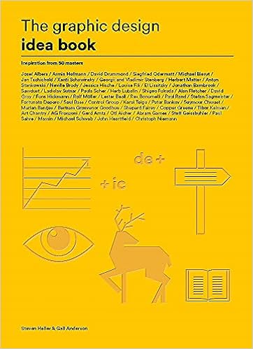
The Graphic Design Idea Book: Inspiration from 50 Masters
The book by Heller and Anderson is a compilation of graphic design pieces created by some of the most well-known designers in the world. You almost don't need the credits to recognise the ability because the work and concepts displayed here are so distinctive and obvious. It is well-organized, practical, and well-thought-out. An easy-to-read tutorial on graphic design principles. An explanation of the fundamental components of excellent design, including examples from renowned designers. Narrative, colour, illusion, adornment, simplicity, wit and humour are only a few of the topics explored.
Comments
Post a Comment