05.11.2021 - 19.11.2021 / Week 11 - Week 13
Yong Li Qing Vernice / 0352288
Bachelor of Design (Hons) in Creative Media
Typography
Task 3B // Type Design and Communication
LECTURE
Week 1 -Week 5 Lecture Notes
INSTRUCTIONS
Task 3B: Type Design and Communication
Yong Li Qing Vernice / 0352288
Bachelor of Design (Hons) in Creative Media
Typography
Task 3B // Type Design and Communication
LECTURE
Week 1 -Week 5 Lecture Notes
INSTRUCTIONS
Task 3B: Type Design and Communication
In this task, we are only allowed to use the 10 typefaces given to create the stickers. Besides that, we are asked to add on with Taylor's Logo in the stickers we had designed. The size for the design is 2048 px*2048 px. After designing the stickers in colours and greyscales, we need to convert them into stickers that can be used on WhatsApp or Telegram.
1. BW option (2048px)
2. Colour option (2048px)
3. PDF of (BW & Colour)
4. Gif Sticker Animation (1024/ 800px)
5. Screen Grab
Progression
1. Sketches
At first, I sketched out some sketches of "Happy Children's Day", but it was hard to express children with only limited elements. So, I sketched out some sketches of "Happy Halloween".

Fig 1.1 Sketches - Happy Children's Day [04 / 11 / 2021]
Fig 1.2 Sketches -Happy Halloween [07 / 11 / 2021]

Reference 1: Halloween Elements (Pumpkin) from Pinterest

Reference 2: Halloween Elements (Bats) form Pinterest

Reference 3: Halloween Elements (Witch &The Witch pot) form Pinterest

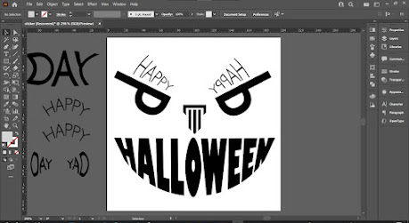
After, I had done my sketches I moved forward to digitalize them in Adobe Illustrator, but before that, I type out the 10 typefaces given and see the difference between them as well as to make a better look on which is suitable for the design.
Fig 2.2 Experiment with different Typefaces [06 / 11 / 2021]
Fig 2.2 Experiment with different Typefaces [10 / 11 / 2021]
Research
Next, I found some elements related to Halloween on Pinterest to assist me while in the process of designing.

Reference 1: Halloween Elements (Pumpkin) from Pinterest

Reference 2: Halloween Elements (Bats) form Pinterest

Reference 3: Halloween Elements (Witch &The Witch pot) form Pinterest

Reference 4: Halloween Elements (Spider Web) form Pinterest
2. Adobe Illustrator - Sticker Design Progression
First of all, I try out with try to create my design based on one of my sketches. afterwards, I change the size of the letters by using a different warp from the make envelope tool in Adobe Illustrator. Hence, I realise the typeface for the design was not suitable for my word "Happy Halloween", thus I change the type font from Gill Sans Std to ITC Garamond Std.
First of all, I try out with try to create my design based on one of my sketches. afterwards, I change the size of the letters by using a different warp from the make envelope tool in Adobe Illustrator. Hence, I realise the typeface for the design was not suitable for my word "Happy Halloween", thus I change the type font from Gill Sans Std to ITC Garamond Std.

Fig 3 "Happy Halloween" Gill Sans Std [11 / 11 / 2021]
Fig 4 "Happy Halloween" ITC Garamond Std [11 / 11 / 2021]
Fig 5 "Happy Halloween" with colours [11 / 11 / 2021]
Fig 6 Process [11 / 11 / 2021]
Reference 5: Colour Palletets From Pinterest
Reference 6: Colour Palletets From Pinterest
Reference 7: Colour Palletets From Pinterest
Fig 7 The colours I used in my designs [16 / 11/ 2021]
Later, I used the Touch Type Tool to change the letters' direction and make it the way I want them to be in the design. After that, I used the colours palette I found on Pinterest and make some experiments.
Fig 8 Greyscale Stickers in Adobe Illustrator [15 / 11 /2021]
Fig 9 Colour Stickers in Adobe Illustrator [16 / 11 /2021]
After I had explored the stickers into PNG I went to Whatsapp Sticker Online (Website: https://wasticker.app/) to convert my design files into Whatsapp stickers and save them in Whatsapp.
After converting the stickers I test them by sending them in WhatsApp to see whether the size of the letters. Furthermore, I experimented by changing the colour of the wallpaper (Dark / Light). In this way, it will make me easier to see the differences and make a comparison between darker wallpapers and lighter wallpapers.
Fig 14 Greyscales stickers on Dark wallpaper[15 / 11 / 2021]
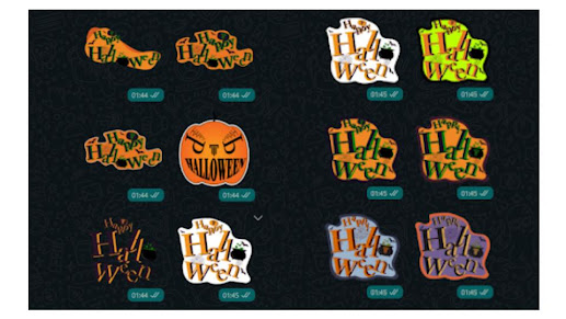
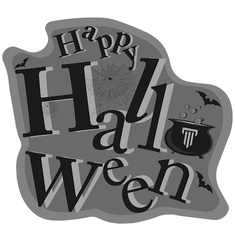
Fig 17 "Happy Halloween" Greyscale Sticker_PNG [16 / 11 / 2021]
3. Adobe After Effect- GIF Progression
So after installing the software, the particular sticker design for me to animate in Adobe After Effect I make a separate file in Adobe Illustrator. Therefore, it may help me to do my work smoothly.
Fig 28 White Matte at the back [19/11/2021]
Fig 15Colour stickers on light wallpaper [16 / 11 / 2021]

Fig 16 Colour stickers on dark wallpaper [16 / 11 / 2021]

Fig 17 "Happy Halloween" Greyscale Sticker_PNG [16 / 11 / 2021]
Fig 18 "Happy Halloween" Colours Sticker_PNG [16 / 11 / 2021]
3. Adobe After Effect- GIF Progression
After making the stickers in Adobe Illustrator, to make 3 seconds looping gif animation, I need to move the sticker into Adobe After Effect. Nevertheless, before I started my design, I watched some tutorials to understand more about how the process goes to make a gif in Adobe After Effect and how the technique can be applied to improve my work to become better. Then, based on the tutorial I had watched, it shows that I was required to download an extension, named Adobe ZXP Installer.
So after installing the software, the particular sticker design for me to animate in Adobe After Effect I make a separate file in Adobe Illustrator. Therefore, it may help me to do my work smoothly.
Fig 19 Separate sticker in another file [17 / 11 / 2021]
Fig 20 Separate objects into different layers [17 / 11 / 2021]
Fig 21 Layers in Adobe Illustrator [17 / 11 / 2021]
Afterwards, I imported the file into Adobe After Effect to make the animation stickers. According to the instruction given (Fig 23)to make a telegram animated sticker we need to install Bodymovin -Tg to achieve the work.
Fig 22 Making Effect in Adobe After Effect [19 / 11 / 2021]
Fig 23 Requirements before exporting Animation [19 / 11 / 2021]
Next, after I had done animated the sticker I export it by pressing Windows > Extensions > Bodymovin for Telegram Stickers. But due to the size of the file being too large and can't export it.TGS. As a result, I exported the composition to a MOV File. Then, I import the MOV in Adobe Photoshop.
Fig 24 Exporting Sticker with Bodymovin [19 / 11 / 2021]
Fig 26 Making the gif in Adobe Photoshop [19/11/2021]As well as like previous, I experimented by changing the matte of the design work into both black and white.
Fig 27 Black Matte at the back [19/11/2021]Fig 28 White Matte at the back [19/11/2021]
As shown that, the gif sticker with a black matte look neater in darker wallpaper compared with the gi with white matte.
Video 1 the compression between whites & black Matte [19/11/2021]
After done making the GIF I sent it in to my phone and used the app named Stiker maker to make my animated sticker. As a result, It had succeeded and moved forward I sent it in WhatsApp and screen recording the sticker movement as well as made a comparison of the colour different wallpaper interact with the black and white matte of the sticker.
Fig 30 sticker make in the app [19/11/2021]
Video 2 Screen Record in WhatsApp
Final Outcome
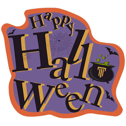
Final Outcome Sticker (Colour)_PNG [16 / 11 / 2021]

Final Outcome Sticker (Greyscale)_PNG [16 / 11 / 2021]
Final Outcome Sticker (Colour & Greyscale)_PDF [16 / 11 / 2021]

Final Outcome Sticker (Colour)_PNG [16 / 11 / 2021]

Final Outcome Sticker (Greyscale)_PNG [16 / 11 / 2021]
Final Outcome Sticker (Colour & Greyscale)_PDF [16 / 11 / 2021]
Link to download sticker pack: https://getstickerpack.com/stickers/hallween-1
FEEDBACK
Week 11-
General Feedback -Mr Vinod remains us to lessen the use of elements, because it may distract from the design of the words. Besides that, he told us to try making the sticker and post it in either WhatsApp or Telegram to check whether the type design is big enough.
Specific Feedback - Based on my sketches (Happy Children's Day) Mr Vinod said that there are too many graphic elements in the design and told me to reduce the use of graphic elements.
Week 12 -
General Feedback - Based on the sketches we have, Mr Vinod suggest we find a colour palette on the website that is suitable for our design.
Specific Feedback - Mr Vinod said that my design(Happy Halloween) have a scary-looking face on the pumpkin but I need to fix the choice of the typeface. Besides that, he also suggested I reduce the size of the pumpkin and its colour.
REFLECTION
This task, make me think more deeply about what does the design means and what does the designer want us to see through their work. As a result, found that there are lots of designs that I used to think are beautiful and great are actually can't express the meaning of the word in the design. My experience in this task was extremely fun although the process of limited elements and the restricted typefaces gave to make the design work, thus I learnt more about how to create an interesting sticker and can be used as my own personal sticker collection. On the other hand, I had had also faced some extremely hard them during making the animation sticker because the size of the file was too large and I had tried to make it over and over again. Although, in the end, I didn't successfully make the sticker out as well as the process is a litter bit harsh and rough precisely because of the repeating work it cause, now I am more familiar with Adobe After effect.
FURTHER READING
I understand the pros and cons of a logo design. The pros for logo design is in this modern society, we used to think about which is the fastest way to get famous or to earn lots of money. Bussuiusman will think of having an iconic logo for their company and they will heir designers into their company to be in charge of the whole company events and social media design. As a designer, it is a way to have stable finance and it will let others know the true value of a designer. On the other hand, because the kind of style designs that society would like and accept are restricted, so it caused the design work designed by the designer will lack purpose and story; As time flies, the main aim of being a designer will be lost.


Comments
Post a Comment