
26.8.2021 - 16.9.2021 // Week 1 - Week 4
Yong Li Qing Vernice / 0352288
Bachelor of Design (Hons) in Creative Media
Illustration and Visual Narrative
Task 1: Exercises - Vormator Challenge // Card Design
Jump Links
LECTURES
Lectures' Jump Links


Figure 1.1 Shapes


Figure 1.6 Expressions / Poses
This week, Miss Anis ask us why there are pictures on Instagram that make us satisfied? It is basically because of the use of the rules of thrid, subject focus and emphasis.

Figure2.1 Lecture's Notes Subject Focus

Figure2.2 Lecture's Notes The Types of Shots

Figure2.3 Lecture's Notes Positive & Negative Space

Figure2.4 Lecture's Notes Positive & Negative Space

Figure2.4 Lecture's Notes Positive & Negative Space

Figure2.5 Lecture's Notes The Rule of Thrids

Figure2.6 Lecture's Notes Background, Midground and Foreground

Figure2.7 Lecture's Notes Create Environment Art
Figure2.6 Lecture's Notes Contrast
Symmetry vs Asymmetry
 Figure2.6 Lecture's Notes Symmetry vs Asymmetry

Figure3.1 Lecture's Notes Perspective- Leading line

Figure 3.2 Lecture's Notes Perspective- Leading line to the middle

Research 1 - Leading line in the painting of "The Last Supper"

Research 2 - Leading line in the painting of "The Last Supper"

Figure 3.3 Lecture's Notes Perspective- Leading line to the middle

Research: Leading line in the painting of "The School of Athens"

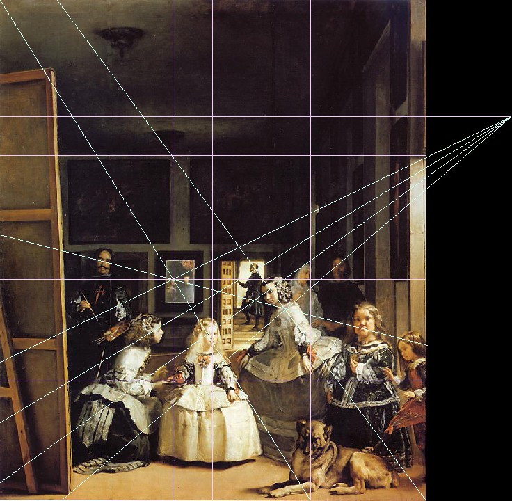
Research: Leading lines in the painting of "Las Meninas"
Figure 3.5 Lecture's Notes Types of Perspectives Points
Figure 3.6 Lecture's Notes -1 Point
Figure 3.7 Lecture's Notes - 2 Points
Figure 3.8 Lecture's Notes - 3 Points
<iframe src="https://drive.google.com/file/d/1nwKZ4z9YMPeQrOdAbslTgks_hx-CLmFc/preview" width="640" height="480" allow="autoplay"></iframe>
<iframe src="https://drive.google.com/file/d/1Cew4gGjCWei6EQXgdvCqOjCyCFQkykiU/preview" width="640" height="480" allow="autoplay"></iframe>
Task 1 Exercise 1 - Vormator Challenge Character (Horror)
<iframe src="https://drive.google.com/file/d/14urO-6GIMikbGQ7sVzK2IjXU_TPSSYhl/preview" width="640" height="480" allow="autoplay"></iframe>
Shape Elements for Vormator Challenge Character
<iframe src="https://drive.google.com/file/d/1XQuQVwEVPpFXiTM4LT8BmG8d_YloCr9N/preview" width="640" height="480" allow="autoplay"></iframe>
Idea Inspiration & Research


Reference: Canyon
https://image.kkday.com/v2/image/get/w_960%2Cc_fit%2Cq_55%2Ct_webp/s1.kkday.com/product_10291/20161109023650_fBQvz/jpg

Reference: Card Design Examples
Reference: Card Design Examples
https://storage.googleapis.com/fabmaster/media/images/Back2.width-800.jpg

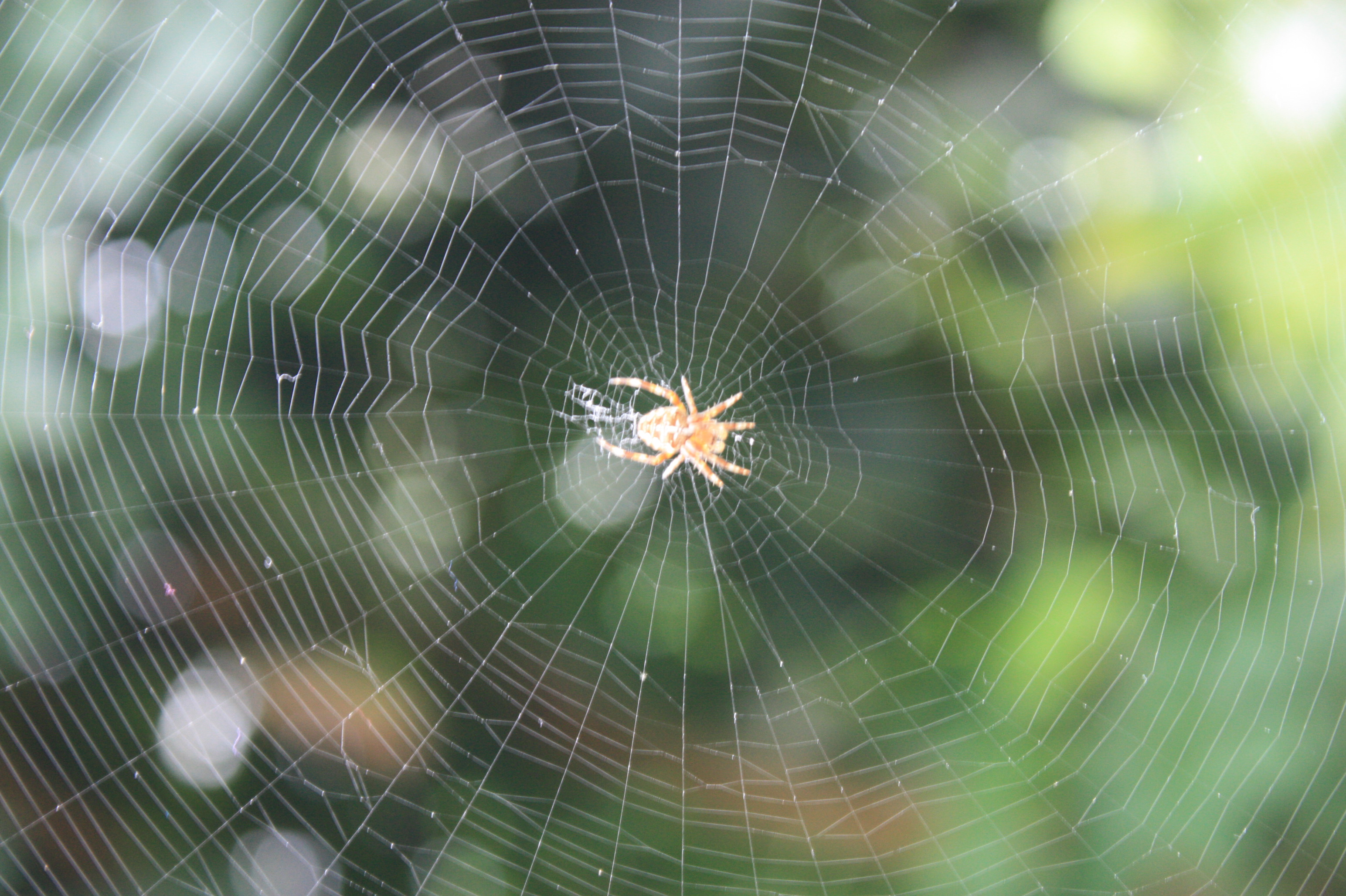
Reference: Spider Web
https://upload.wikimedia.org/wikipedia/commons/2/24/A_classic_circular_form_spider%27s_web.jpg
Design Progression
First, I draw out the trees by using the Paintbrush Tool. Then, I copy, paste it at the right and make the opacity down to 65% with the same way paste another further from the front tree but with an opacity of 40%. Besides that, I had tried 2 additional backgrounds (the mountains, and the lines ).
Fonts:
Berlin Sans FB Demi Bold (Bold): (Gluttony & Constant Cravers)
Berlin Sans FB (Regular): (Absorb all kinds of attacks for two random rounds.)
Algerian (Regular): (DA)* (DA= Dungeon of Ashes)
Experiment
Besides that, I had experimented with different colour frames and backgrounds for my card design.

Fig 26 Making the frame


Fig 29 Experimented with the Fonts for Gluttony's name

Fig 30 Experimented with different colours

Fig 31 Changing the colours of the frames

Fig 32 Experimented with colour for the name

Fig 33 Back of the Card Design

Fig 34 Using the Symbol Spyaper Tool to make some symbol

Fig 35 Putting the symbols and drop shadow

Fig 36 Putting DA in the back (Light Blue) (DA= Dungeon of Ashes)

Fig 37 Experimented with different colours (Blue)

Fig 38 Experimented with different colours (Dark Blue)


FEEDBACK
Yong Li Qing Vernice / 0352288
Bachelor of Design (Hons) in Creative Media
Illustration and Visual Narrative
Task 1: Exercises - Vormator Challenge // Card Design
Jump Links
LECTURES
Lectures' Jump Links
A warm welcome by Miss Anis, Miss Jennifer and Miss Anis's cats😂 to all new semester students. After done a short introduction, they had briefed us on the exercises and tasks that we have to be done in this semester. For instance, character design, Gifs, posters and our comic on webtoon. Following with introducing where we can get and find important information, lectures notes and tutorial videos. Next, they had introduced the first exercise for this module, the Vormator Challenge Character Design, we are only allowed to use the 8 shapes given to design our character.
In this week, we learnt that good character designs are formed by basic shapes. To make a character design unique are shape, colour, emphasis & contrast, harmony and expressions.
Shape
Shapes define a character's silhouette. It is used to identify a character from one another and it makes the character iconic.
Figure 1.1 Shapes
Figure 1.2 Shapes
Colour
Besides shape, colours had played an important role to decide which part does the character take part in. Different choices of colours will give different impressions and emotions to the character.
Figure 1.3 Colour
Emphasis & contrast
A good character design is when picking one visual element in a character and making it outstanding and significant.
Figure 1.4 Lecture's Notes Emphasis &Contrast
Harmony
All shapes, lines, colours, concepts, patterns must be put together in a pleasant style. Every element used in a design must work together and transform into a balance of visual elements that has a visual hierarchy.
Figure1.5 Harmony
Expressions / Poses
To make the characters win the heart of an audience is their behaviour, quirks, personalities that are visually shown.
Figure 1.6 Expressions / Poses

This week, Miss Anis ask us why there are pictures on Instagram that make us satisfied? It is basically because of the use of the rules of thrid, subject focus and emphasis.

Figure2.1 Lecture's Notes Subject Focus
Types of Shots/ Composition
Besides that, she had introduced the shots used in films moods like establishing, bird's eye view, framing, medium shot, close-up shot, worm's eye view. It applies in scenes, animation, films, movies, drama, making a storyboard, website application and games.
- Establishing - To have wide-angle shots
- Bird's eye view - Up to sky and have a wider shot, in a different angle
- Framing - Feels flat and have the subject matter framed with something to highlight
- Medium shot - Have a relatively with our subject matter
- Close-up shot - Force our audience to almost as close as the possible subject matter
- Worm's eye view - Force our self and the audience on the ground and look up the subject from the ground

Figure2.2 Lecture's Notes The Types of Shots
Positive & Negative Space
It's the light play, how do light and shadow play onto the scene to make a balance of positive and negative in the scene. After having balance in positive and negative space it is possible to make up the colour schemes, moods of the scenes. This way it will make more flow and rhythm in the scenes.

Figure2.3 Lecture's Notes Positive & Negative Space

Figure2.4 Lecture's Notes Positive & Negative Space

Figure2.4 Lecture's Notes Positive & Negative Space
The Rule of Thrids
It's a guideline used to compose imagery, the aim being to ensure a piece is visually appealing and balanced. It is formed by 9 queal parts and to make the image to be more interesting by putting it in the 4 points that the lines had made.
Figure2.5 Lecture's Notes The Rule of Thrids
Background, Midground and Foreground
It forms the space by creating an effective sense. The subject matter is often in the foreground or midground. Besides that, the setting of the subject matter is settled in the background is often used.

Figure2.6 Lecture's Notes Background, Midground and Foreground

Figure2.7 Lecture's Notes Create Environment Art
Contrast
Contrast means using a dramatic shift or change of aspect of visuals within the image and it will guide the viewer's eyes through the image. It will feel bored while there are non-contrast in the image and it will make the viewer feel confusing. By using light and dark or it also can be applied to colour, scale and texture.
Figure2.6 Lecture's Notes Contrast
Symmetry vs Asymmetry

This week, we had discussed perspectives, especially for visual design in environment and layout. It will look odd if the piece of work did not use perspectives. But one of the artists, Filippo the architecture used the leading line in his artwork and makes the piece become 3D and have negative space by the use of light and dark. The definition of perspectives in arts is basically is to create depth and a sense of space into the paintings. Besides, it forms the object from a 2D flat surface and makes it into a 3D illusion.

Figure3.1 Lecture's Notes Perspective- Leading line
The Last Supper / Da Vinci
Additional Research:
Reference: Implied Line in The Last Supper
Reference: Wikipedia: The Last Supper (Leonardo)
Additional Research:
Reference: Implied Line in The Last Supper
Reference: Wikipedia: The Last Supper (Leonardo)

Figure 3.2 Lecture's Notes Perspective- Leading line to the middle
Research 1 - Leading line in the painting of "The Last Supper"
Research 2 - Leading line in the painting of "The Last Supper"
The School Of Athens - Raphael
Additional Research:
Reference: Wikipedia: The School of Athens
Reference: (Article) Leading lines in The School of Athens
Reference: Story Behind The School of Athens
Additional Research:
Reference: Wikipedia: The School of Athens
Reference: (Article) Leading lines in The School of Athens
Reference: Story Behind The School of Athens

Figure 3.3 Lecture's Notes Perspective- Leading line to the middle
Research: Leading line in the painting of "The School of Athens"
Las Meninas - Diego Velázquez
Additional Research:
Las Meninas

Figure 3.4 Lecture's Notes Perspective- Leading line
Research: Leading lines in the painting of "Las Meninas"
Types of Perspectives
- 1 point - The most simple method of producing 3D images entails the objects emerging from a single point on the horizon.
- 2 points - There are vanishing points on either side of the horizon and the objects and buildings within the scene are drawn to both of these vanishing points.
- 3 points - It usually consists of two vanishing points on opposite sides of a horizon.
- 4-5 points
Figure 3.5 Lecture's Notes Types of Perspectives Points

Figure 3.6 Lecture's Notes -1 Point

Figure 3.7 Lecture's Notes - 2 Points

Figure 3.8 Lecture's Notes - 3 Points
INSTRUCTIONS
<iframe src="https://drive.google.com/file/d/1nwKZ4z9YMPeQrOdAbslTgks_hx-CLmFc/preview" width="640" height="480" allow="autoplay"></iframe>
<iframe src="https://drive.google.com/file/d/1Cew4gGjCWei6EQXgdvCqOjCyCFQkykiU/preview" width="640" height="480" allow="autoplay"></iframe>
Vormator Challenge Character
<iframe src="https://drive.google.com/file/d/14urO-6GIMikbGQ7sVzK2IjXU_TPSSYhl/preview" width="640" height="480" allow="autoplay"></iframe>
Shape Elements for Vormator Challenge Character
<iframe src="https://drive.google.com/file/d/1fXoWeFweK4vyh7W4Hf6xS5hEJEk_8SNs/preview" width="640" height="480" allow="autoplay"></iframe>
/pee-jellyfish-154422026-resized-56a2f5823df78cf7727b4c45.jpg)
Reference: Jellyfish
https://www.verywellhealth.com/thmb/HsmTtMf65j7NlcBHeI-ejz8vJyM=/1280x854/filters:fill(87E3EF,1)/pee-jellyfish-154422026-resized-56a2f5823df78cf7727b4c45.jpg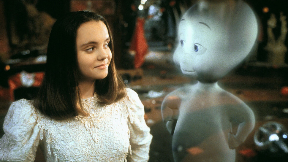
Reference: Cartoon Movie Gasper
https://www.intofilm.org/intofilm-production/scaledcropped/970x546https%3A/s3-eu-west-1.amazonaws.com/images.cdn.filmclub.org/film__18803-casper--hi_res-ea6d33b5.jpg/film__18803-casper--hi_res-ea6d33b5.jpg

Reference: Candle
https://upload.wikimedia.org/wikipedia/commons/thumb/4/4b/Candle.jpg/1200px-Candle.jpg
For my second sketch, the ideal was while I am trying to think of another horrifying character, a spider was crawling on my table and it give me inspiration by drawing it out. Next, I had to do some research for my character and end up with The movie: Lion King and some insects that I don't like (scorpions, spiders and beetle).😅For this character I named it Gluttony.

Reference: Lion
http://uncommonlove.online/wp-content/uploads/2017/10/9e3017c79509adb3640d1ca0d47aed18.jpg
Reference: Spider
https://st4.depositphotos.com/1830989/27297/i/600/depositphotos_272973152-stock-photo-giant-house-spider-isolated-on.jpg
Reference: Scorpion's stinger
https://static.bangkokpost.com/media/content/20210901/c1_2174635_210901111618.jpg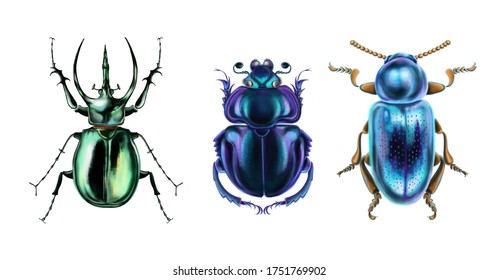
Reference: Beetle
https://image.shutterstock.com/image-illustration/illustration-set-beautiful-shiny-beetles-260nw-1751769902.jpg
Design Progression

Sketch 2 (Name: Gluttony)

Fig 1 Shapes I used in my design.
After that, I fill up the shapes with colours and I had found out Gluttony face is quite odd so I had to change the shapes of its face.


The background story of Gluttony
Gluttony, originally known as Arachne of the labyrinth, who resided in the great Dungeon of Ashes, before his death. Legends have it that he was offered an amount of food too much that he can eat by adventurers who venture deep into the dungeon to pray for good luck. Being the kind-hearted spider he is, he tried to finish everything he was offered and ended up dead a week later by over-eating. It was said that 15 tonnes of food are still left to this day with 10 tonnes of food coming in every day. His desire to consume everything offered to him allowed him to rise the ranks in Tartarus as Gluttony, one of the seven sins of the damned.
Final Submission for Exercise 1

Final Submission for Vormator Challange Character Design
PRACTICAL - Task 1 / Exercise 1
In this task, we were asked to design a Vormator Challenge Character design by using only 8 elements shapes given by Miss Anis and Miss Jennifer. After that give the character a name and design the background story for our character.
Idea Inspiration & Research
My first sketch for the design and it reminds me of the cartoon I had watched before Gasper a cute ghost trying to scare others. So, I had found some researches on Google, like jellyfish, candles and a movie I had watched recently, Soul. The name for my first sketch character is Ha Ha.😂😂(The first thought pop out to me while I am watching it)
 |
| Sketch 1 (Name: Ha Ha) |
Reference: Jellyfish
https://www.verywellhealth.com/thmb/HsmTtMf65j7NlcBHeI-ejz8vJyM=/1280x854/filters:fill(87E3EF,1)/pee-jellyfish-154422026-resized-56a2f5823df78cf7727b4c45.jpg
Reference: Cartoon Movie Gasper
https://www.intofilm.org/intofilm-production/scaledcropped/970x546https%3A/s3-eu-west-1.amazonaws.com/images.cdn.filmclub.org/film__18803-casper--hi_res-ea6d33b5.jpg/film__18803-casper--hi_res-ea6d33b5.jpg
Reference: Candle
https://upload.wikimedia.org/wikipedia/commons/thumb/4/4b/Candle.jpg/1200px-Candle.jpg
For my second sketch, the ideal was while I am trying to think of another horrifying character, a spider was crawling on my table and it give me inspiration by drawing it out. Next, I had to do some research for my character and end up with The movie: Lion King and some insects that I don't like (scorpions, spiders and beetle).😅For this character I named it Gluttony.
|
| Sketch 2 (Name: Gluttony) |

Reference: Lion
http://uncommonlove.online/wp-content/uploads/2017/10/9e3017c79509adb3640d1ca0d47aed18.jpg
Reference: Spider
https://st4.depositphotos.com/1830989/27297/i/600/depositphotos_272973152-stock-photo-giant-house-spider-isolated-on.jpg

Reference: Scorpion's stinger
https://static.bangkokpost.com/media/content/20210901/c1_2174635_210901111618.jpg
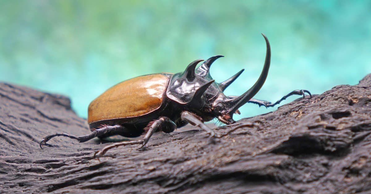
Reference: Beetle
https://image.shutterstock.com/image-illustration/illustration-set-beautiful-shiny-beetles-260nw-1751769902.jpg
Sketch 2 (Name: Gluttony)

Fig 1 Shapes I used in my design.
First, I had used the Pen tool to draw out the shapes I needed for my Vormator challenge Character Design.
 |
| Fig 2 Drawing out the shapes |
 |
| Fig 3 My first digital sketch of Gluttony |
 |
| Fig 4 Fill Colour Into My Design |
 |
| Fig 5 Changing the Face Shape |
After adding colours for Gluttony I experimented with different colours to make a comparison.
 |
| Fig 6 Experiment: Trying Different Colour for Gluttony's Fur |
 |
| Fig 7 Experiment: The Colours Tried On Gluttony |
 |
| Fig 8 Outline of Gluttony |
 |
| Fig 9 Experiment: Trying Different Colours on Gluttony (Light blue, Black, Blue) |
 |
| Fig 10 Experiment: Trying Different Colours on Gluttony (Orange) |
 |
| Fig 11 Experiment: Trying Different Colours on Gluttony (Purple) |
 |
| Fig 12 Experiment: Trying Different Colours on Gluttony (Light blue, Orange, Purple, Black, Blue, Grey) |
Fig 13 Welcome the"Sextuplests"😂😂😂
 |
| Fig 14 Introducing The Body Parts of Gluttony |
The background story of Gluttony
Gluttony, originally known as Arachne of the labyrinth, who resided in the great Dungeon of Ashes, before his death. Legends have it that he was offered an amount of food too much that he can eat by adventurers who venture deep into the dungeon to pray for good luck. Being the kind-hearted spider he is, he tried to finish everything he was offered and ended up dead a week later by over-eating. It was said that 15 tonnes of food are still left to this day with 10 tonnes of food coming in every day. His desire to consume everything offered to him allowed him to rise the ranks in Tartarus as Gluttony, one of the seven sins of the damned.
Final Submission for Exercise 1

Final Submission for Vormator Challange Character Design
Final Submission for Task 1 Exercise 1
<iframe src="https://drive.google.com/file/d/1TmbwixInReEradzIPKRFcbANHZV8Xs6n/preview" width="640" height="480" allow="autoplay"></iframe>
<iframe src="https://drive.google.com/file/d/1TmbwixInReEradzIPKRFcbANHZV8Xs6n/preview" width="640" height="480" allow="autoplay"></iframe>
<iframe src="https://drive.google.com/file/d/1XQuQVwEVPpFXiTM4LT8BmG8d_YloCr9N/preview" width="640" height="480" allow="autoplay"></iframe>
Reference: Spooky Tree
https://i.pinimg.com/originals/93/89/f8/9389f8571202a2599c5e4c7a79ce62f0.jpg
https://i.pinimg.com/originals/93/89/f8/9389f8571202a2599c5e4c7a79ce62f0.jpg

Reference: Canyon
https://image.kkday.com/v2/image/get/w_960%2Cc_fit%2Cq_55%2Ct_webp/s1.kkday.com/product_10291/20161109023650_fBQvz/jpg
Reference: Card Design Examples

Reference: Card Design Examples
https://storage.googleapis.com/fabmaster/media/images/Back2.width-800.jpg
Reference: Spider Web
https://upload.wikimedia.org/wikipedia/commons/2/24/A_classic_circular_form_spider%27s_web.jpg
First, I draw out the trees by using the Paintbrush Tool. Then, I copy, paste it at the right and make the opacity down to 65% with the same way paste another further from the front tree but with an opacity of 40%. Besides that, I had tried 2 additional backgrounds (the mountains, and the lines ).
Fonts:
Berlin Sans FB Demi Bold (Bold): (Gluttony & Constant Cravers)
Berlin Sans FB (Regular): (Absorb all kinds of attacks for two random rounds.)
Algerian (Regular): (DA)* (DA= Dungeon of Ashes)
 |
| Fig 15 Draw out the Tree |
 |
| Fig 16 Copy and Paste Further, Opacity 65% |
 |
| Fig 17 Copy and Paste Further, Opacity 40% |
To change the colours in the background I had used the Recolour Artwork Tool and the Colour Swatches I had made to change the colour of the background.
 |
| Fig 18 Changing the colours |
 |
| Fig 19 Making My Own Colour Swatches |
Besides that, I had experimented with different colour frames and backgrounds for my card design.
 |
| Fig 20 Changing the Frame colours |
 |
| Fig 21 Draw out the Mountain |
 |
| Fig 22 Copy and Paste The Mountain |
 |
| Fig 23 Make Clipping Mask fit in the Image |
 |
| Fig 24 Put (Gluttony) in the Middle and Change the Colours of the Background |
 |
| Fig 25 Draw out the lines |

Fig 26 Making the frame

Fig 27 Put Gluttony into the frame

Fig 28 Making some space to put Gluttony's name

Fig 29 Experimented with the Fonts for Gluttony's name

Fig 30 Experimented with different colours

Fig 31 Changing the colours of the frames

Fig 32 Experimented with colour for the name
For the back of my card design, I had used The Symbol Spyaper Tool to make some symbols for it and draw out some spider web with the Pen Tool. Then I had used the Gradient Tool to blend colours in the lines for the frames.

Fig 33 Back of the Card Design

Fig 34 Using the Symbol Spyaper Tool to make some symbol

Fig 35 Putting the symbols and drop shadow

Fig 36 Putting DA in the back (Light Blue) (DA= Dungeon of Ashes)

Fig 37 Experimented with different colours (Blue)

Fig 38 Experimented with different colours (Dark Blue)

Fig 39 Experimented with different colours (Purple)

Fig 40 The four Colour I had Experimented


Fig 41-44 The Experimented Designs for the Front of the cards


Fig45-48 The Experimented Designs for the Front of the cards


Fig53- 57 The Experimented Designs for the Back of the cards
Fig 41-44 The Experimented Designs for the Front of the cards
Fig45-48 The Experimented Designs for the Front of the cards
Fig 49- 52 The Experimented Designs for the Front of the cards
Fig53- 57 The Experimented Designs for the Back of the cards
Final Submission for Exercise 2
Final Submission for Card Design
Final Submission for Task 1 Exercise 2<iframe src="https://drive.google.com/file/d/1c_9plAUKAOQxMCq8fh2Lzf1TdHAcGU1g/preview" width="640" height="480" allow="autoplay"></iframe>
Final Submission for Task 1 Exercise 2
FEEDBACK
Week 2 -
Ms Anis said that it is better to stick with sketch 2 and try to find the solution to make the fur and notice the colour used for the character.
Week 3 -
It is good but tries to explore more with the tools in Adobe Illustrator and the colours used for the character.
Week 4 -
Remember to make some copies for AI files, otherwise, it is a tough way to redo it again.😭😭
REFLECTIONS
In this Task, I had found interest in how character is formed and the basics of how important it is for a design with having different kinds of things must be learnt. Additionally, I am not good at designing or drawing characters but through this task, I think there is some improvement in my skills but meanwhile, there is a lot to be learned from, thus I am looking forward to the improvement in the future task. On the other hand, I had tried different kinds of tools that I haven't tried before and it feels new to me but I manage to handle it although I had some difficulties on the way to the end.
Comments
Post a Comment