10.10.2023 - 3.11.2023 // Week 7 - Week 10
Yong Li Qing Vernice / 0352288
Bachelor of Design (Hons) in Creative Media
NEXT COURSE OF ACTION
SUBMISSION
REFLECTION
This task was worked on during the Independent learning week and all of my teammates are using this week to rush for the other modules as well but we managed to communicate and work within the limited timeline. In this task, although I am not specialising in graphic design I am happy that I can help in the process, I felt it was quite interesting and bask in the achievements process of making the design outcomes.
Yong Li Qing Vernice / 0352288
Bachelor of Design (Hons) in Creative Media
Collaborative design practice
Task 3 // Produce rapid prototypes, test and iterative design
INSTRUCTION
RESEARCH
PROCESS
FEEDBACK
Week 7 -
INSTRUCTION
RESEARCH
Before starting designing the packaging my groupmates and I did some research on the suitable packaging design over the past few weeks during Task 2: Art Direction progression. So the design concept is to make it minimalist and playful as our client had mentioned before starting from Week 1 up to now. In addition, we also did some study and research on the materials that we are going to use for the packaging as we know that different qualities and materials will effect the outcome of the design.
Research on packaging design
Study of different packaging materials by Cecilia
PROCESS
Week 7 -
This week we share some of our progression on our website and animation with Ms Lilain. But due to we needed more information for the website and packaging, our progression was slightly backwards compared to other groups.
So, we listed a list of the information and questions to the Business School for both website and packaging design. At first, they provided us with the content with only a brief description. After some days we received a document with all the different names of the bamboo bottles and mugs as well as the customization images and word size requirements.
List of questions for the project
Answer from TBS_pdf
(Detailed) Content provided by TBS_pdf
Besides, we also held a meeting with both the Business School Students and Mass Communication students to double-confirm everything to make sure the brand identity and art direction are on the same page. Additionally, we to share some of our progression with the Business school students to have feedback from them.
Meeting screenshot of TBS & TDS & SOMAC
Week 8 -
This week is Independent Study Week, after the meeting we had last week we continue working on our own part and getting everything done before the innofest.
We split our work according to the specialization but due to our group having 4 UI/UX students, Siew Ni, Cheryl and Britney are focusing on designing the website. For the promotional video, Jomin is in charge of making and editing the video while Evaleez is helping Jomin to build 3D models of the Bamboo bottles. Lastly, Cecilia, Evaleez and I are helping out designing the packaging for the bamboo bottles.
The first design template concept that I got from Cecilia is a box with a holder in it to prevent the bottle from moving around. However, after discussion, we felt that it doesn't reflect the requirement we have which is reusable packaging.
First template concept
First template design for packaging
So, decided to change the template design to another type of packaging box which is a sleeve sliding box. We share the new ideas that we have with the business school students along with the designs we make for the packaging.
Second template concept
Second template design for packaging (Sleeve's cover box &Inner box)
In the process of designing the packaging, I decided to do some research related to the layout and wording placement in the template before proceeding with designing the packaging.
Own research on the layout of packaging
Design attempts_Cecilia
Design attempts_Evaleez
In the design process, I did some experiments on the background using the types of circle combinations we have, but the outcomes could have been clearer. So by using Cecilia's design attempts, I made some changes and experimented by using the bamboo leaves in the background the outcome was surprisingly lively and it also made the selovet of the bamboo bottles stand out.
Experiments_Vernice
Moving on, I changed the direction for the bamboo and tested out the wording placement. Furthermore, I made two versions of the design on the bamboo one with full colour and another with only outlines. As for the inner box, I think it would be too plain to put it blank so I decided to add the bamboo leaves in the design to create a connection with the cover design.
Versions of design_Vernice
Design attempt_Vernice
Design Picked by TBS
Process of Designing the Mockup
As soon as possible after getting feedback from the business school students, I proceeded to do the mockup version for them. So, first I researched some tutorial videos that related to making 3D mockups in Adobe Illustrator. So the video below teaches step-by-step how the design was made.
3D Box Packing Mockup In Adobe Illustrator_Youtube
First, I followed the steps in the video by making all the pages of the needed packaging design into individual items and then, rasterise them. Each will be a flat photo image ready for the next step.
Process Of Designing Mockup_Individual items
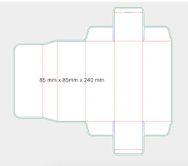
Then create a rubric from the 3D effect in Adobe Illustrator. First of all, I created a rectangular according to the size that we have which is 85mm*240mm and 95mm*185mm. After that, I created the boxes' depths which are 85mm and 95mm. To make the audience know both sides of the design, I show 2 different directions of the box.
Process Of Designing Mockup_3D makingFrom the previous rasterise images, I drag and drop them into symbols. In the symbols slot, the images must be renamed according to their respective pages and pick “graphic“ in the symbol type.
Process Of Designing Mockup_SymbolsAfter making all the symbols with their own names click on Appearance > 3D Extrude & Bevel >Map artwork to the surface of 3D. Then I choose the symbols according to the respective side of the 3D model and repeat the process with the others.
Process Of Designing Mockup_Map Artwork in 3DThe outcome of the first draft mockup design for the 2 bamboo bottles.
First Mockup for the two bottles
Week 9 -
This week me and Cecilia made some changes to the word layout direction and the colour of the bottles. So, the overall design will be more consistent and user-friendly for consumers to read the text on the box. After that, we continued making the packaging designs for the rest of the other bottlers ( The Bold, The Classic, The Tempo).
Changes in the direction and colour
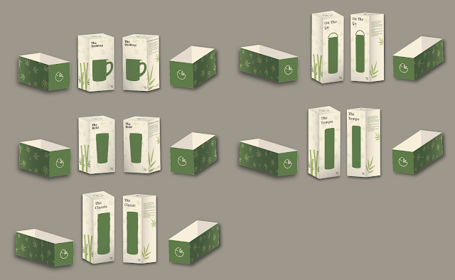
Moving on, after finalizing all of the designs, I repeated the process of making the mockup of all of the bottles again.
All the mockups for the design
Mockups design_PDF
85mm packaging_PDF
95mm packaging_PDF
Week 10 -
For this week we are doing our Task 3: Produce rapid prototypes, test and iterative design presentation for Mrs Lilian.
FEEDBACK
Week 7 -
According to Ms Lilian, in order to make the process of creating the website easier and faster, we should speak with our customer as soon as possible about the specifications for the packing and the information we need. The promotional video is moving along nicely, but there is still room for improvement on the other deliverables.
Week 8 -
Independent Study Week
Week 9 -
Ms Lilian gave some feedback on the text alignment not being justified on the website so it will be easier to read for the user. Besides, she also told us that overall is looking good but the graphic elements are slightly heavy on the homepage. For the promotional video, she commented on the typography text not being outlined and for the intro, the text can be placed in another better way. Moreover, the packaging designs and mockups, look nice and incorporate the graphic elements well.
NEXT COURSE OF ACTION
Week 7 -
Get all the documents and information needed to proceed to make the design process smooth.
Week 8 -
Continue working on what was left off for the packaging design.
Week 9 -
Finalizing all the artwork for task 3 and start preparing slides for next week's presentation.
Week 10 -
Get feedback from our clients to get improvement for the overall designs.
SUBMISSION
Team 2_Task 3_Presentation Slides
REFLECTION
I think our group are working hard together to achieve what our clients want in terms of the design expectations and timeline they provided us as well as the module requirements. To be honest, one thing to comment for our clients are not really communicating well with us. For example, they are not providing the information we need for the designs on time, so the procession for the overall designs is a bit backwards. Besides, they also did not respond to us as soon as possible after we had sent the designs we made for them to get some feedback for improvements.


.jpg)


Comments
Post a Comment