15.10.2021 - 29.10.2021 / Week 8 - Week 10
Yong Li Qing Vernice / 0352288
Bachelor of Design (Hons) in Creative Media
Typography
Task 3A // Type Design and Communication
LECTURE
Week 1 - week 5 lecture notes
INSTRUCTIONS
<iframe src="https://drive.google.com/file/d/1xV-ZrBdthvFNxTLmezVyDwF3gJe0J3cy/preview" width="640" height="480" allow="autoplay"></iframe>
TASK 3A - Type Design and Communication
In this task, we are told to design a type by using the letters given in while Mr Vinod briefed us in class.
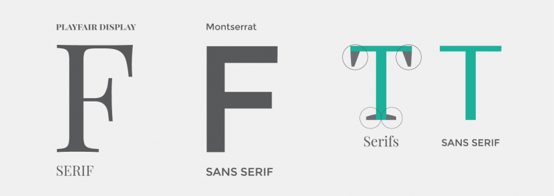
Before I started my type design sketches, I explored more about Serif and Sans Serif and the differences between them.

Fig 4 Anatomy of typography

Fig 5 Typefaces Anatomy

Fig 6 Anatomy of Typography

Fig 7 Annotate in Alphabets

Fig 8 Anatomy of typography [Named: AP23]_Design by David Wise

Fig 9 Different styles of the letter "A"

Fig 10 The Type Classification System
Reference
Website: Typography Handbook
Google Font Website: https://fonts.google.com/
Sketches
The sketches I started with the reference I had found on google and Pinterest and tried out the letter given in both uppercase and lowercase.
Fig18 Letters for the design
Before starred my design I deconstructed 2 different typefaces from the 10 provided typeface.
Janson Text LT Std and Bembo Std.
a. [Janson Text LT Std] Font Website:
REFLECTION
In this task, I had learnt different structures in different kinds of fonts and the way to present a typeface needs to spend time and effort to achieve the result I need. Besides that, in this task, I had grown interested in designing the typeface. Although I need to spend more time doing some research before I started the work, thus I enjoyed the process of what we learned and gain knowledge from the articles I found.
Yong Li Qing Vernice / 0352288
Bachelor of Design (Hons) in Creative Media
Typography
Task 3A // Type Design and Communication
LECTURE
Week 1 - week 5 lecture notes
INSTRUCTIONS
<iframe src="https://drive.google.com/file/d/1xV-ZrBdthvFNxTLmezVyDwF3gJe0J3cy/preview" width="640" height="480" allow="autoplay"></iframe>
TASK 3A - Type Design and Communication
In this task, we are told to design a type by using the letters given in while Mr Vinod briefed us in class.
- Ascender height
- Capital height
- Mean/median line
- Baseline
- Descender line
- X-height
Fig 1 Letters
Research on type designBefore I started my type design sketches, I explored more about Serif and Sans Serif and the differences between them.
Fig 2 Serif VS Sans Serif
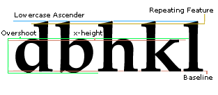
Next, to understand more how letters are structured and form in different styles and the basic principles that must be aware while designing the type.

Fig 4 Anatomy of typography

Fig 5 Typefaces Anatomy

Fig 6 Anatomy of Typography

Fig 7 Annotate in Alphabets

Fig 8 Anatomy of typography [Named: AP23]_Design by David Wise

Fig 9 Different styles of the letter "A"

Fig 10 The Type Classification System
Overshoot
Wikipedia: Overshoot_(typography)
Wikipedia: Overshoot_(typography)
Website: Typography Handbook
Website: How to design a Font
https://www.digitalartsonline.co.uk/features/typography/how-design-typeface-step-by-step-guide/
Website: Font design17 top tips to create your own typeface
Website: Font design17 top tips to create your own typeface
Google Font Website: https://fonts.google.com/
Sketches
The sketches I started with the reference I had found on google and Pinterest and tried out the letter given in both uppercase and lowercase.

Fig18 Letters for the design
Fig 19 The comparison between the fonts

Fig 20 Type Design Sketch 1 [13/ 10/ 2021]

Fig 21 Type Design Sketch 2 [13/ 10/ 2021]

Fig 22 Type Design Sketch 3 [13/ 10/ 2021]
Verify & Deconstruct References
Fig 20 Type Design Sketch 1 [13/ 10/ 2021]

Fig 21 Type Design Sketch 2 [13/ 10/ 2021]

Fig 22 Type Design Sketch 3 [13/ 10/ 2021]
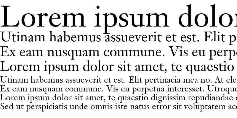
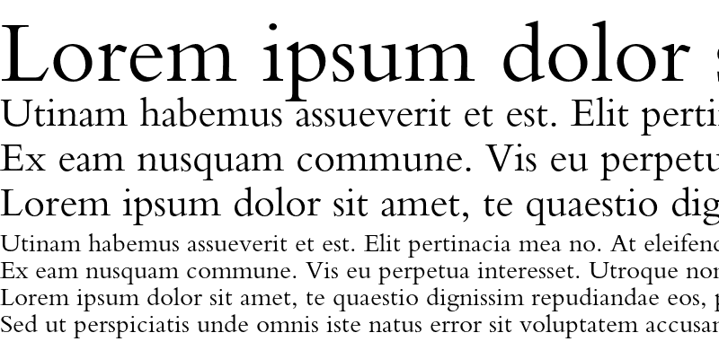
Before starred my design I deconstructed 2 different typefaces from the 10 provided typeface.
Janson Text LT Std and Bembo Std.
a. [Janson Text LT Std] Font Website:
https://media.fontsgeek.com/generated/j/a/janson-text-lt-std-55-roman-sample.png
Progression
Digitlezile font

Fig 27 Guides [14 / 10/ 2021]

Fig 28 Construction progress First [21 / 10/ 2021]

Fig 29 Construction progress Second [23 / 10/ 2021]
Fig 30 Font Outline [23 / 10/ 2021]

Fig 31 Screenshot of the letters [23 / 10/ 2021]

Fig 32 Before Feedback_Type design in Adobe Illustrator [22 / 10/ 2021]

Fig 33 After Feedback_Type design in Adobe Illustrator [23 / 10/ 2021]Developing font in FontLab 7
FINAL OUTCOME
Gloomy: https://drive.google.com/file/d/1pii6VhaorJ8dVuap1XMGB30kM3eiozfb/view?usp=sharing
Week 9
Fig 23 Janson Text LT Std
Fig 24 Deconstruct "r" [Janson Text LT Std]
b. [Bembo Std] Font Website:
b. [Bembo Std] Font Website:
Digitlezile font
First I did the sketch of my font in Adobe Illustrator and according to Mr Vinod tutorial video I stark my work.

Fig 27 Guides [14 / 10/ 2021]

Fig 28 Construction progress First [21 / 10/ 2021]

Fig 29 Construction progress Second [23 / 10/ 2021]

Fig 30 Font Outline [23 / 10/ 2021]

Fig 31 Screenshot of the letters [23 / 10/ 2021]
Fig 32 Before Feedback_Type design in Adobe Illustrator [22 / 10/ 2021]
Fig 33 After Feedback_Type design in Adobe Illustrator [23 / 10/ 2021]
- Ascender height / 752 pt
- Capital height / 702 pt
- Mean/median line / 500 pt
- Baseline / 0 pt
- Descender line / -235 pt
FINAL OUTCOME
Gloomy: https://drive.google.com/file/d/1pii6VhaorJ8dVuap1XMGB30kM3eiozfb/view?usp=sharing
Fig 37 "Gloomy" Typo Poster A4 - JPEG [25 / 10/ 2021]
Fig 39 "Gloomy" Typo Poster A4 - PDF [25 / 10/ 2021]
Fig 38 Final Task 3A: Type Design and Communication "Gloomy" - PDF [25 / 10/ 2021]
Fig 39 "Gloomy" Typo Poster A4 - PDF [25 / 10/ 2021]
FEEDBACK
Week 9
Mr Vinod based on my design I posted on Facebook said that my design still need more detail and I can get the reference from Bombe
REFLECTION
In this task, I had learnt different structures in different kinds of fonts and the way to present a typeface needs to spend time and effort to achieve the result I need. Besides that, in this task, I had grown interested in designing the typeface. Although I need to spend more time doing some research before I started the work, thus I enjoyed the process of what we learned and gain knowledge from the articles I found.
Next, while in the progress of doing sketches I had felt a bit lost. So, I suffer on the internet to find some tutorial or explanation based on the task I am doing. In addition, I had asked my family members which font do they think is more preferred for them to help me improve my sketches as well as to make me explore more ideas to add to the design.
FURTHER READING
FURTHER READING


Comments
Post a Comment