Yong Li Qing Vernice / 0352288
Bachelor of Design (Hons) in Creative Media
Typography
Task 2 // Text Formatting and Expression
LECTURE
Lecture link (Week 1-Week 5)
INSTRUCTIONS
<iframe src="https://drive.google.com/file/d/1xV-ZrBdthvFNxTLmezVyDwF3gJe0J3cy/preview" width="640" height="480" allow="autoplay"></iframe>
Task 2: Text Formatting and Expression
In this task, we had told to design a 2 pages editor speared, in the size of 200 x 200 mm with the given text provided. Besides that, in this task, we are only allowed to use Adobe Indesign to design our layout and for our design, we are not allowed to use any image and colour, but some basic elements are accepted like dots, lines and shapes. On the other hand, the headline of our design can be finished in Adobe Illustrator.
Research
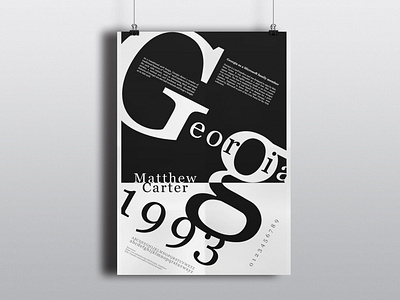
Before starting my design I had done some research based on the design and the design I would like to create. After that, I roughly draft out some sketches that I would like to present in the design.

Figure 3 Reference [2 /10 / 2021]

In this task, we had told to design a 2 pages editor speared, in the size of 200 x 200 mm with the given text provided. Besides that, in this task, we are only allowed to use Adobe Indesign to design our layout and for our design, we are not allowed to use any image and colour, but some basic elements are accepted like dots, lines and shapes. On the other hand, the headline of our design can be finished in Adobe Illustrator.
Research
Before starting my design I had done some research based on the design and the design I would like to create. After that, I roughly draft out some sketches that I would like to present in the design.

Figure 3 Reference [2 /10 / 2021]
Sketches

Figure 4 Sketches [2 /10 / 2021]

Figure 5 Sketches [2 /10 / 2021]

Figure 4 Sketches [2 /10 / 2021]

Figure 5 Sketches [2 /10 / 2021]
After Feedback Mr Vinod said that try not to directly draft our sketches digitally. Therefore I had resketched my sketches.

Figure 6 Sketches [2 /10 / 2021]


Figure 6 Sketches [2 /10 / 2021]
Progression
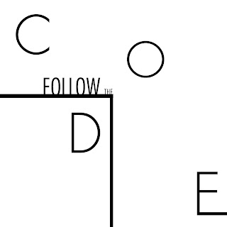
Figure 6 First Design of Headline Progression [3 /10 / 2021]

Figure 8 Second Design of Headline Progression [3 /10 / 2021]


Figure 9 First Design of Headline outcome Progression [3 /10 / 2021]


Figure 10 Second Design of Headline outcome Progression [3 /10 / 2021]
After I had finished the headlines, I continued the design in Adobe Indesign. I tried out the headline I design with the text and done some adjustments for the headline.

Figure 11 Progression in Adobe Indesign [6 /10 / 2021]

Figure 12 Progression in Adobe Indesign [6 /10 / 2021]

Figure 13 Progression in Adobe Indesign [6 /10 / 2021]

Figure 11 Progression in Adobe Indesign [6 /10 / 2021]

Figure 12 Progression in Adobe Indesign [6 /10 / 2021]

Figure 13 Progression in Adobe Indesign [6 /10 / 2021]
Final Outcome of Task 2: Text Formatting and Expression
Font: Univers LT Std (45 Light)
Font Size: 9 pt
Leading: 11 pt
Paragraph space: 11 pt
Line Length: 56
Font Size: 9 pt
Leading: 11 pt
Paragraph space: 11 pt
Line Length: 56
Final Outcome of Task 2 [6 /10 / 2021]
Final Outcome of Task 2 in PDF [6 /10 / 2021]
<iframe src="https://drive.google.com/file/d/1c3HbrLyaA695ySoxDKM0eJTUc7ZM69vI/preview" width="640" height="480" allow="autoplay"></iframe>
FEEDBACK
Week 6
- Try not to use digital to make our sketch.
- Try not to use digital to make our sketch.
REFLECTION
Experience:
Experience:
In this task, I had found the difficulty used in Adobe Indesign. Therefore, I need to spend more time doing research look at some tutorials to hit the target. It is a challenge for me to improve my skills.
Observation:
While I am designing the design I had found that while using lines can make my headlines to be more flow but not use it much because it will make distraction from the text I need to show the viewer.
Findings:
In this task, I learned that before doing this task got enough information and ideas will help my design process be more smooth and I will get a better view as a viewer in this design to give myself some judgement.
FURTHER READING

Vignelli Canon – Rationale
PDF File
What I had learned from this book is this book had taught me how to place the word in the right place with the use of small squares on a piece of paper. Besides that, It had describes the different Typefaces and the different uses of the fonts and which is often used as headlines. In addition, It also had taught me how to make a design layout look nice and make the reader view more comfortable.


Comments
Post a Comment