
Bachelor of Design (Hons) in Creative Media
Advanced Typography
Task 3 / Type Exploration and Application
LECTURE
Advanced Typography / Week 1- Week 5 Lectures
LECTURE
Advanced Typography / Week 1- Week 5 Lectures
INSTRUCTION
Task 3: Type Exploration and Application
A. Exploration
In this task, we are assigned to develop a font that is intended to solve a larger problem or meant to be part of a solution or explore the use of a typeface in our area of interest as an exploration. Hence, we were told to come out with 3 different proposals for the area that we are aiming to make improvements to or the area of topic that interested to work on with.
So, I came out with three different proposals that I am interested in motion light, fire and Egypt font.
- Motion Light
The first idea that came to my mind is motion light. For some reason, it reminds me of the firecrackers that we played with when CNY. It's a fun game to play and children like to play them a lot, but when we used them and scribble lines in the air at high speed the light that the firecracker creates somehow will form pictures. So, if we took photos of the moving firecracker in which the person is drawing the type in the air we may get photos of letters. - Fire
The second idea is experimenting with only using fire frames from lighters to create the letters with the help of the movement of the air. The reason that I picked this as one of my design directions is that I think it will be quite interesting to see the outcome created by the fire frames. Besides that, it may also become a reference for designing a more natural look of typeface. - Egypt Font
The third idea is one of the areas of my interest, Ancient Egypt hieroglyphics. I always have had a huge interest in the mysterious Egypt history and the story behind them. In my opinion, in the exploration and research process, I found it quite surprising because the reference fonts that I found are somehow too graphical and kind of lost the meaning of designing a typeface. So, I decided to design a typeface that includes the elements of the Egyptian and at the same time keeps the purpose of the typeface.
Fig 1 Type Design - Proposal slides_PDF
<iframe src="https://drive.google.com/file/d/1Ba_XhH6BQ4Zo8PkZdJYXZF3-fUSMLG6o/preview" width="640" height="480" allow="autoplay"></iframe>

Fig 2 Short animation of the slides
So, after rounds and rounds of struggling with which to choose I end up deciding to choose the Egypt font. Therefore, knowing more about the history of Ancient Egypt as well as its hieroglyphics, I studied various websites that talk about the history of ancient Egypt and watched a few documentaries about the topic that I am working on. So that it will help me develop better in the process of designing the type.
Video 1
Decoding the Secrets of Egyptian Hieroglyphs | Ancient Egyptian Alphabet | The Great Courses
Video 2
Secrets of the Egyptian Hieroglyphics
Video 3
Scribes Of Ancient Egypt: The Art Of Egyptian Hieroglyphs (Full Documentary) | Perspective
B. Sketches
After collecting all the information that I needed I move on to the process of sketching out the typeface that I wanted to be on a paper. (Fig 3 - Fig 7)

Fig 3 Sketches


Fig 7 Sketches
C. Digitalize
After sketching out the type (Fig 3- Fig 7), I move them to the digitalizing stage to sketch out the first draft of the digital sketch in Adobe Illustrator. (Fig 8)

In the first draft, I'm not quite satisfied with the outcome so I make some minor changes to make the design look more comfortable and equal. So in the second draft (Fig 9), I make the design look more equal and also finalised the draft letters.

Fig 9 Second digital design draft
Next, before I make any changes to the font I make the path to the outline stroke so that I can easily change the thickness of the letters. After all that I started adding thickness to the typeface so that it won't be too thin. Besides that, I also make the corners of the letters become round corners. (Fig 10 - Fig 11)

Fig 10 Adding thickness to the typeface


Fig 12 Full set of font design

Fig 13 Full set of font design Outline

Fig 14 Finalised Letters JPEG
Fig 15 Finalised Letters PDF
D. In FontLab
At this stage, I move my design into FontLab to start the process of kerning letter font, but before I move them into FontLab I united all the shapes in the letters into one shape. Next, I copy and place them into their particular alphabet according to the place given. (Fig 16 - Fig 19)


Fig 18 The typeface in Uppercase, Lowercase, Numbers, Punctuations

Fig 19 Showcase of the Letters
After done, kerning the letters, I exported them and named them AfterLife. The reason I named them AfterLife is because in the period of Ancient Egypt they believe that although a person had died their soul will remain to live around in a different dimension, they also believe that the souls of the dead received another chance to live will return to the body and live for the entity. Therefore, in my opinion, although there are tons of Egyptian typeface design, every design have a second chance to be reborn with the help of others that identify the problem and make a solution to redesign the typeface again.

Fig 20 Typeface file name: Afterlife
D. Application
After designing the typefaces, in this stage, we need to add the application that fits our typeface. Hence, I found some images form online and used them as my application design of the typeface. (Fig 21 - Fig 27)


Fig 21 - Fig 27 Designing Appication


Fig 29 Appication_Stationary


Fig 31 Appication_Bag

Fig 32 Appication_Book

Fig 33 Appication_Flag

Fig 34 Appication_Bookmark
Final Outcome of Task 3
Font Name: After Life
Link to Download Font:

Fig 36 Final Outcome Type font_ After Life_PDF
Fig 40 Final Outcome Appication_Bag JPEG
Fig 41 Final Outcome Appication_Book JPEG
Fig 42 Final Outcome Appication_Flag JPEG
Fig 43 Final Outcome Appication_Bookmark JPEG
Fig 44 Final Outcome Appication_PDF
FEEDBACK
Week 10
General Feedback:
Mr Vinod told us to explore and find a good idea to do for our final task. Is our finding to solve a problem or make improvements to an existing design or experiment on a new typeface in the area of our interest?
Specific Feedback:
-
Week 11
General Feedback:
- Holiday
Specific Feedback:
- Holiday
Week 12
General Feedback:
The typeface that we design must fit well for the application that we choose and it had hit the main purpose why we choose and design it.
Specific Feedback:
The store for the typeface is too thin and needs to add thickness to the letters.
Week 13
General Feedback:
Mr Vinod reminds us to listen back to the recording from last week what the feedback is given and from there make improvements in our design.
Specific Feedback:
-
REFLECTION
Experience
In this task, I experience the most tirest task I have ever done before. The type of design that I choose is quite wide and the outcome that I am aiming to hit is quite high. Besides that, in the process of this task, I can't work smoothly because during this period most of the time I fell ill and I almost spend my day in bed struggling with fever and cool. Although the process is tough, I can't say that I manage to overcome all the difficulties I had faced so far.
Observation
In this task, in the stage of exploring the design type, we wanted to do I was surprised that there was not much typeface design that really focus on designing the type but adding lots of graphical elements into the typeface. What I learned from this task is patience, never rush while designing a typeface because it will rush for it it will never look good. Besides that, the lecture I learned in semester 1 had been very useful while I am designing the typefaces as they had guide me on what to avoid while designing the typeface.
Findings
Throughout this task, learnt many other things aside then typeface design. For instance, this task had make me understand deeper the area of interest that I am interested in the process of exploration and study of the topic chosen. To sum up, although the process is tiring the outcome for me is satisfying.
FURTHER READING

Let's Talk Type by Tony Seddon
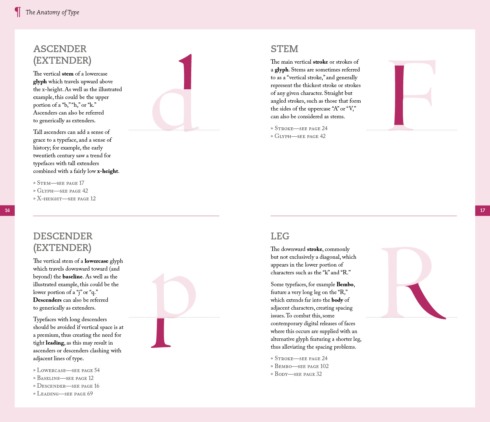
In this chapter (Chapter 1), The Anatomy of Type explains all the parts of a type and how does it look like while only highlighting the one part of it. in this chapter, I had learnt the different thickness of the type and how was showcased in every different letter.

In this chapter (Chapter 2), Glyphs introduce and explain where they will be used the most and the meaning each Glyphs stand for.

This chapter (Chapter 3), Type Terms talks about all the related information about the type, like alignments, kerning, font size, tracking, leading, orphan, widow, and the types of the typeface (bold, italic, roman, etc.). Besides that, it also introduces different types of design styles of designing typefaces.

In the fourth chapter, Type Classification describes all of the different categories of typefaces and the history of these typefaces.
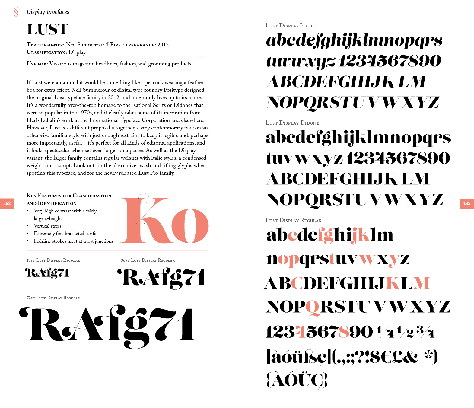
Last But not the least, the last chapter introduces all the famous typefaces in the world, displays the full set of that particular typeface and explains the unique part that makes it special with explaination.
Comments
Post a Comment